

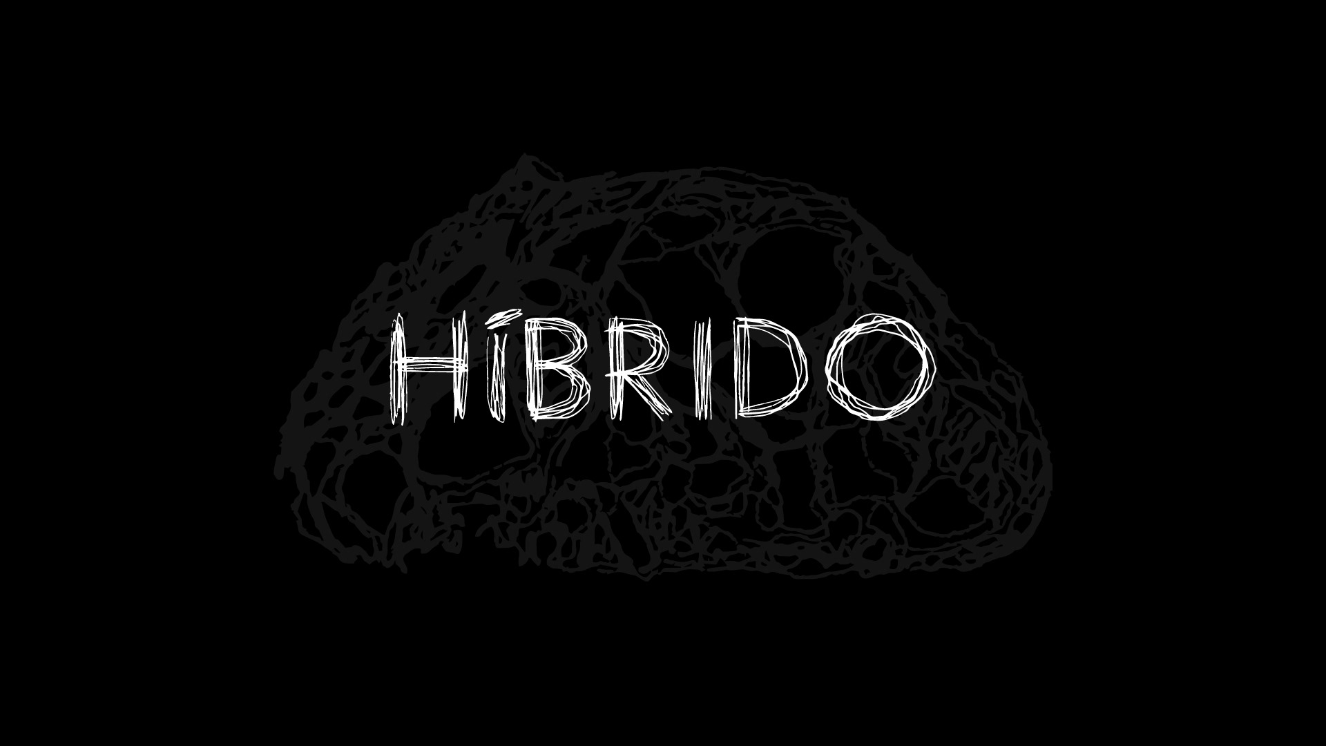
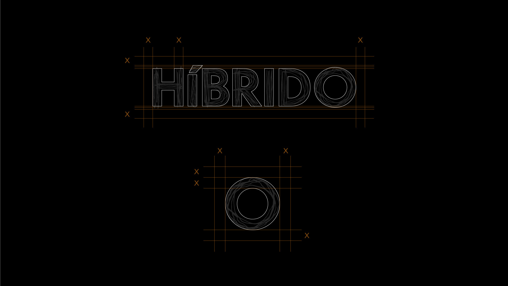
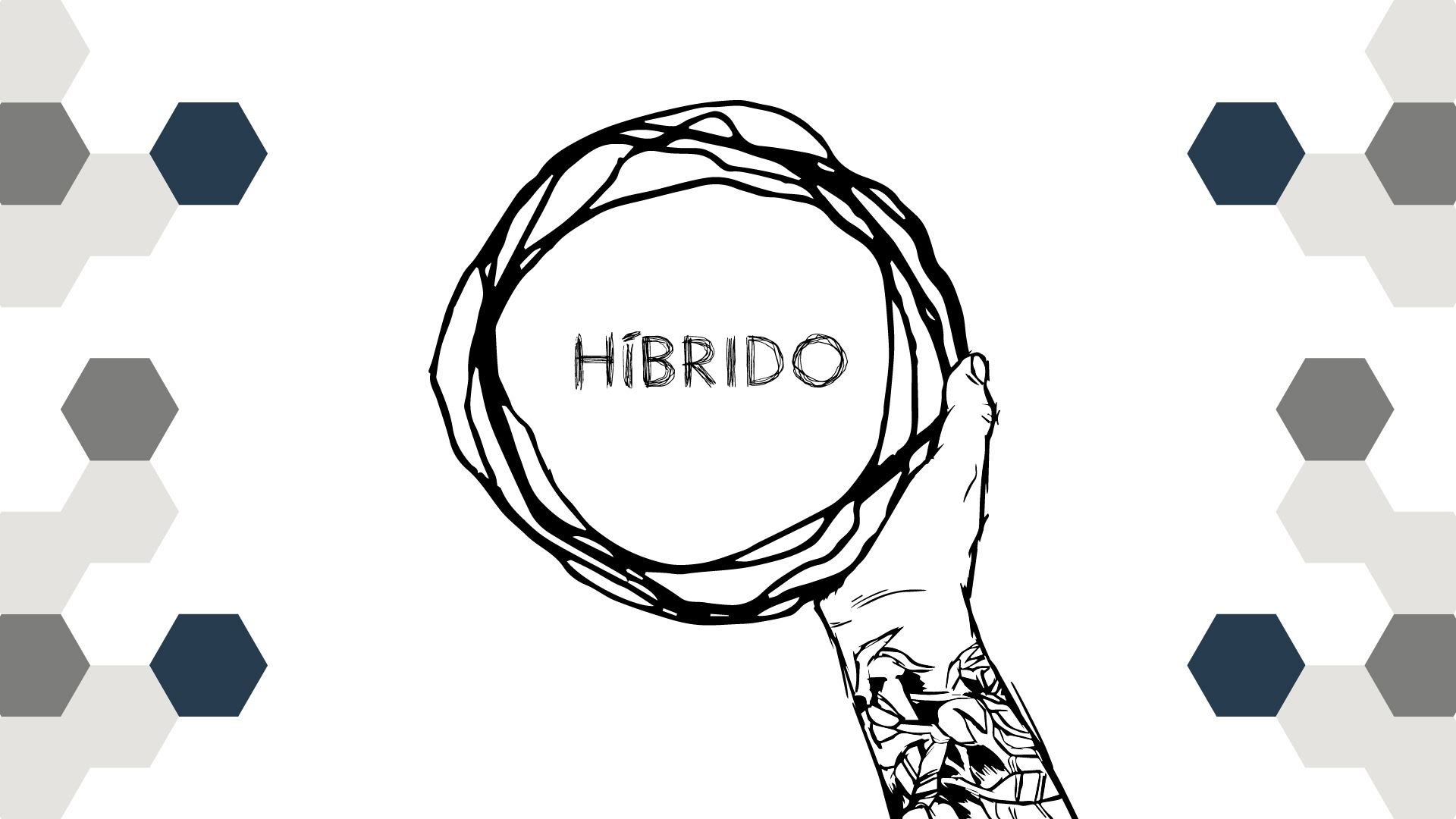
HÍBRIDO
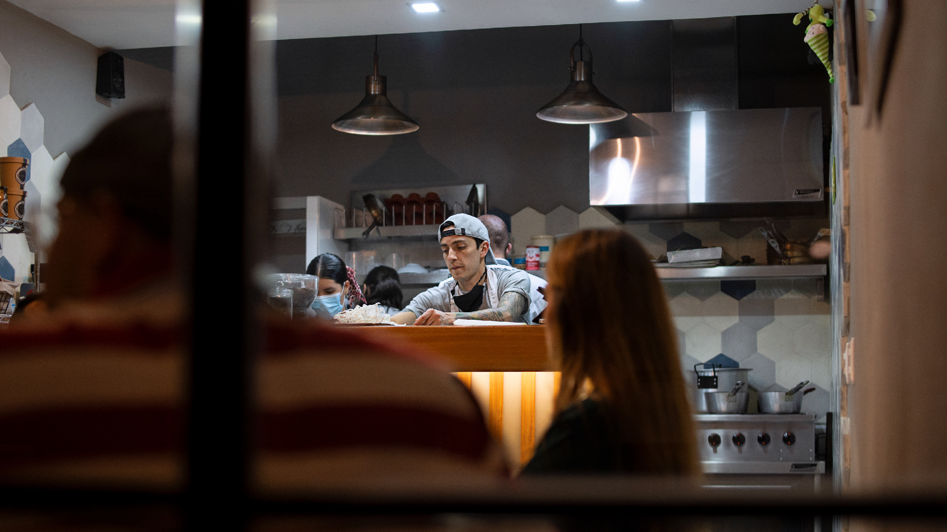
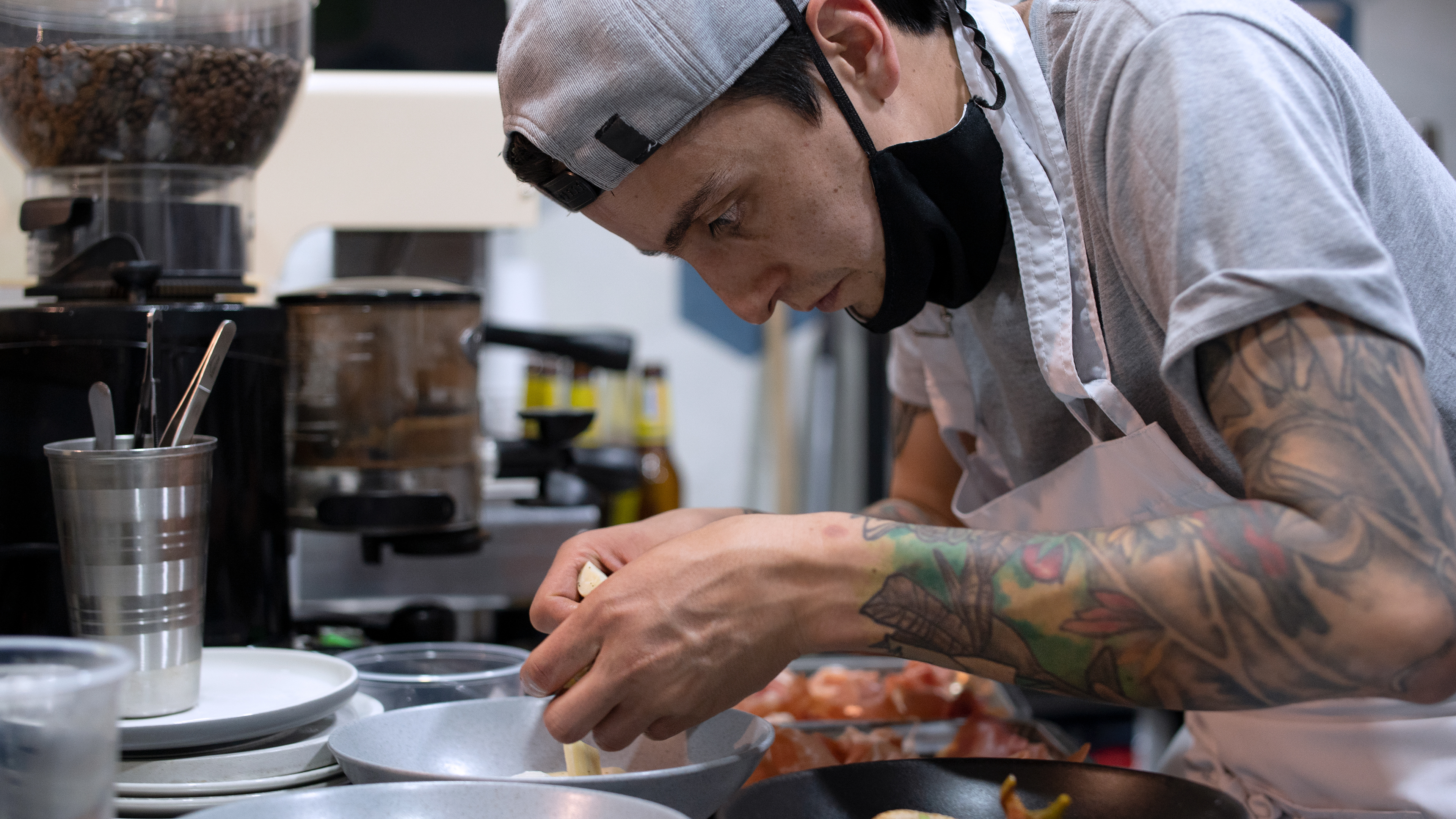
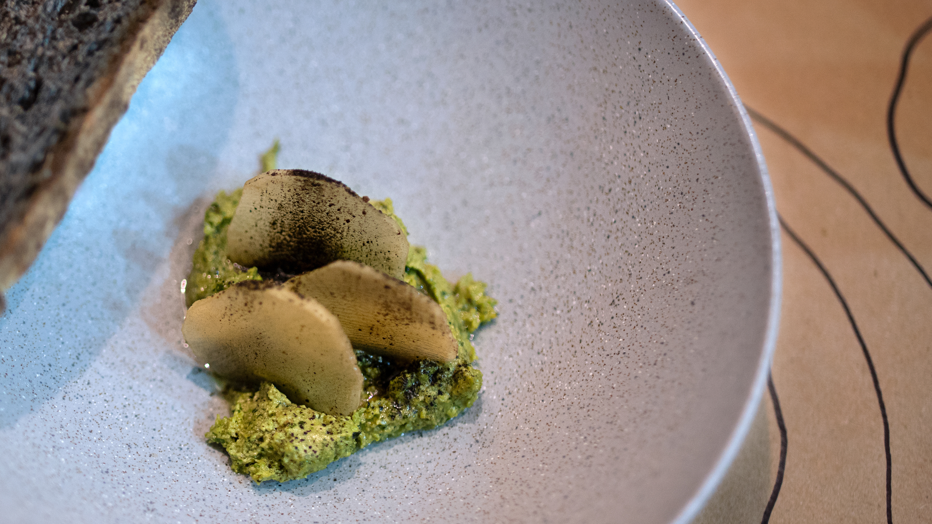
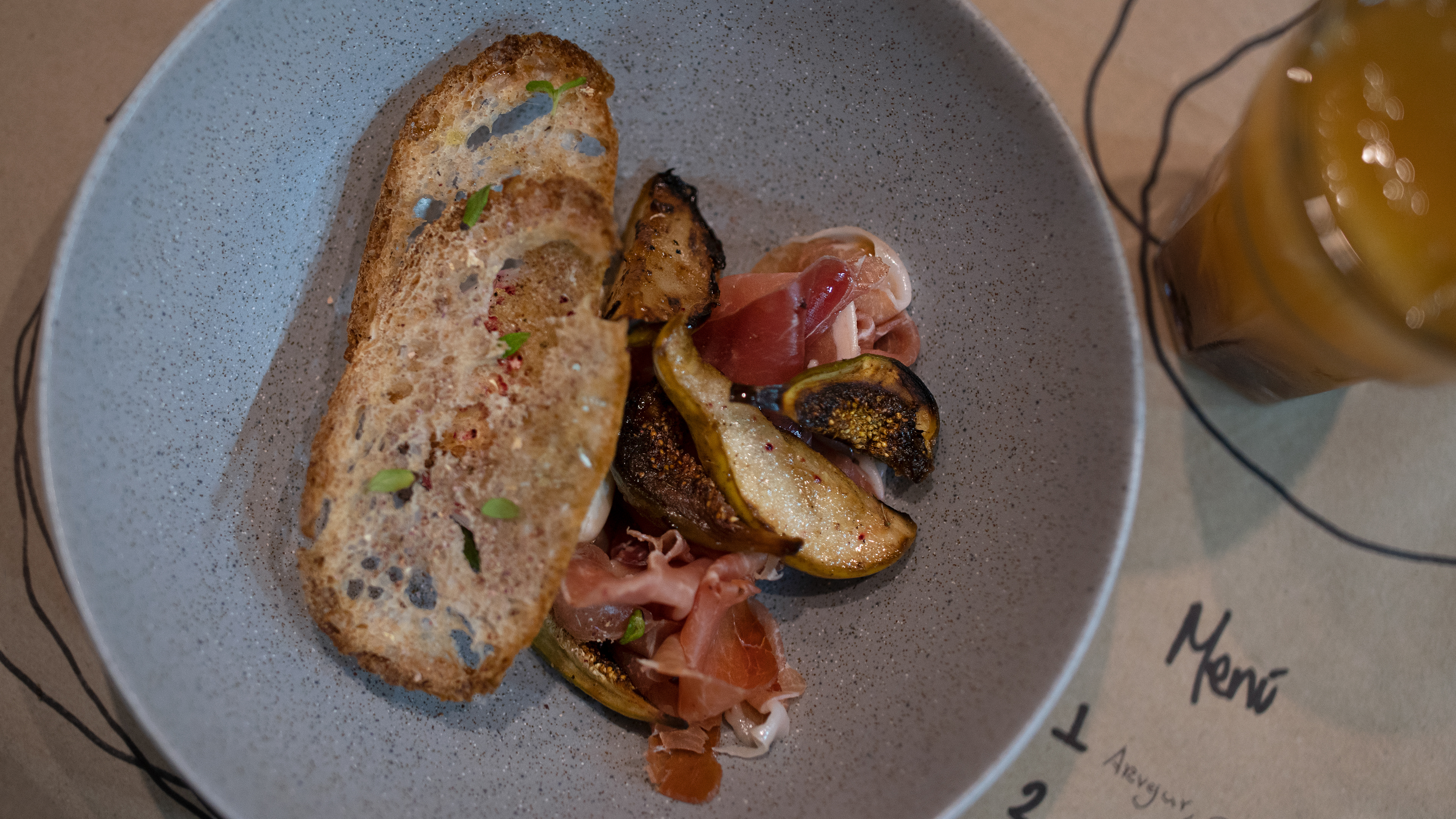
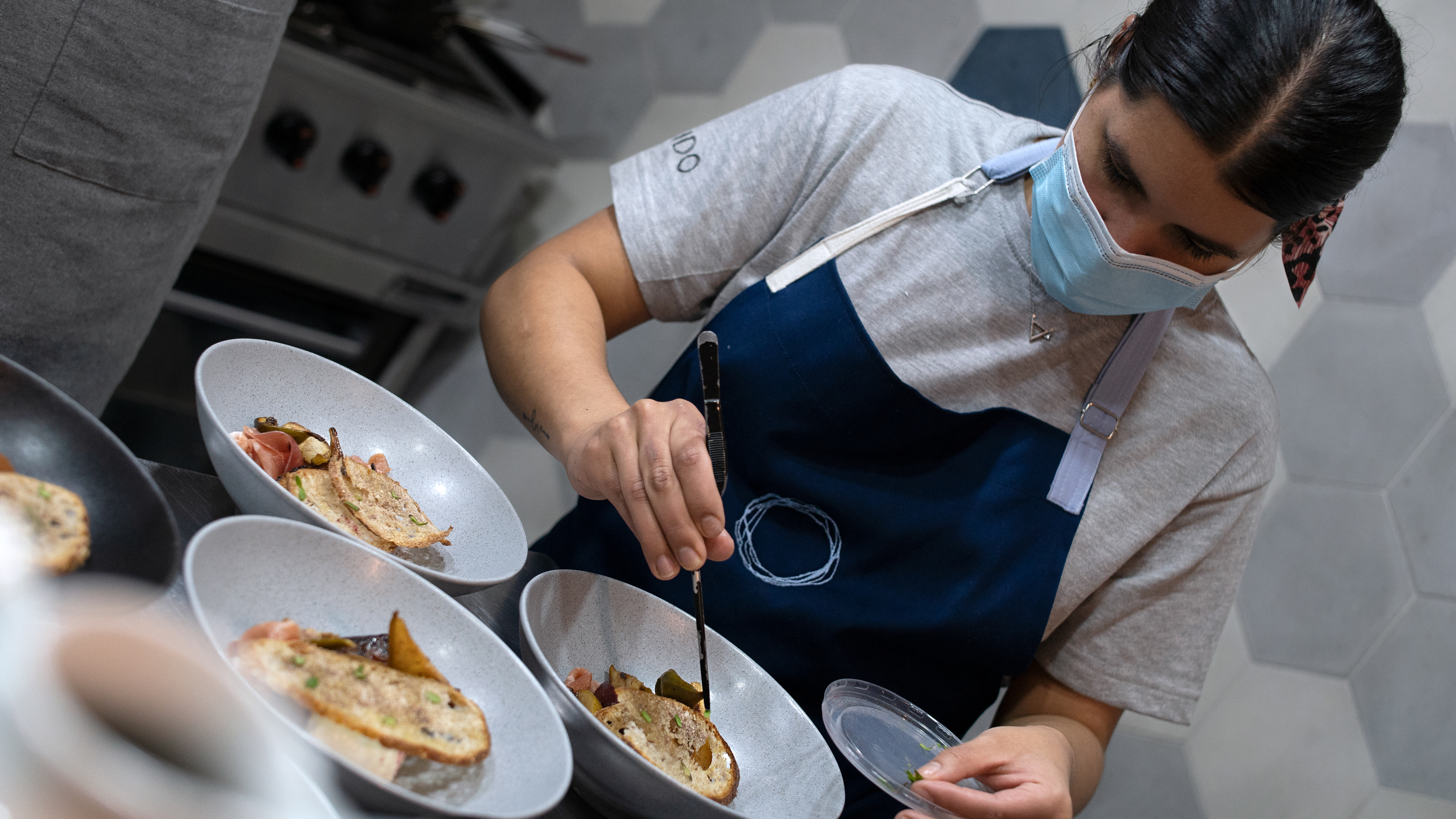
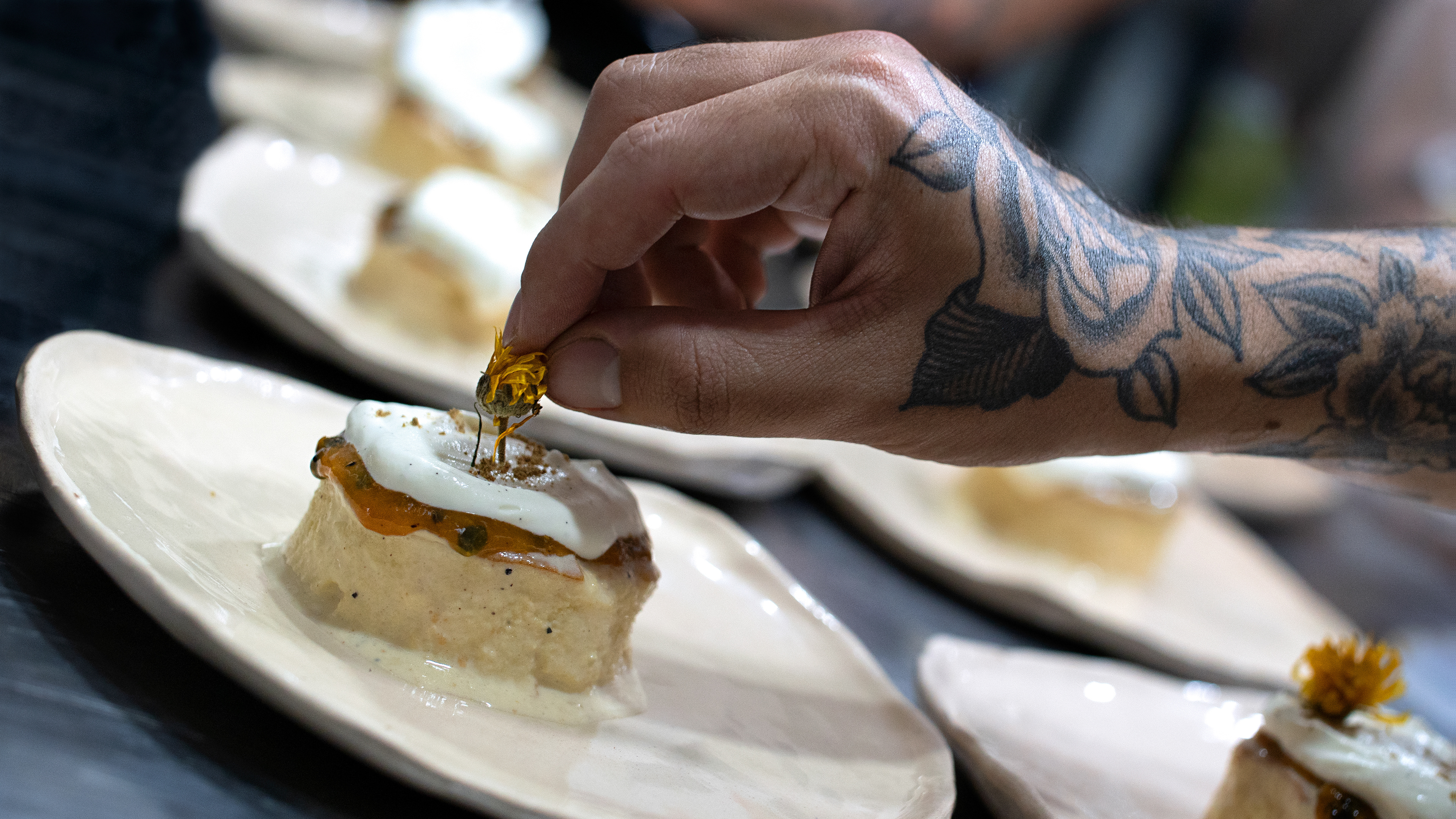
Híbrido is a restaurant that offers different gastronomic experiences, in which its main product is sourdough bread, in which each of its dishes are comprised of a hybrid of bakery and restaurant. The visual concept focuses on the different textures and shapes that are taken from the textures of the bread and the shapes that are part of this place.
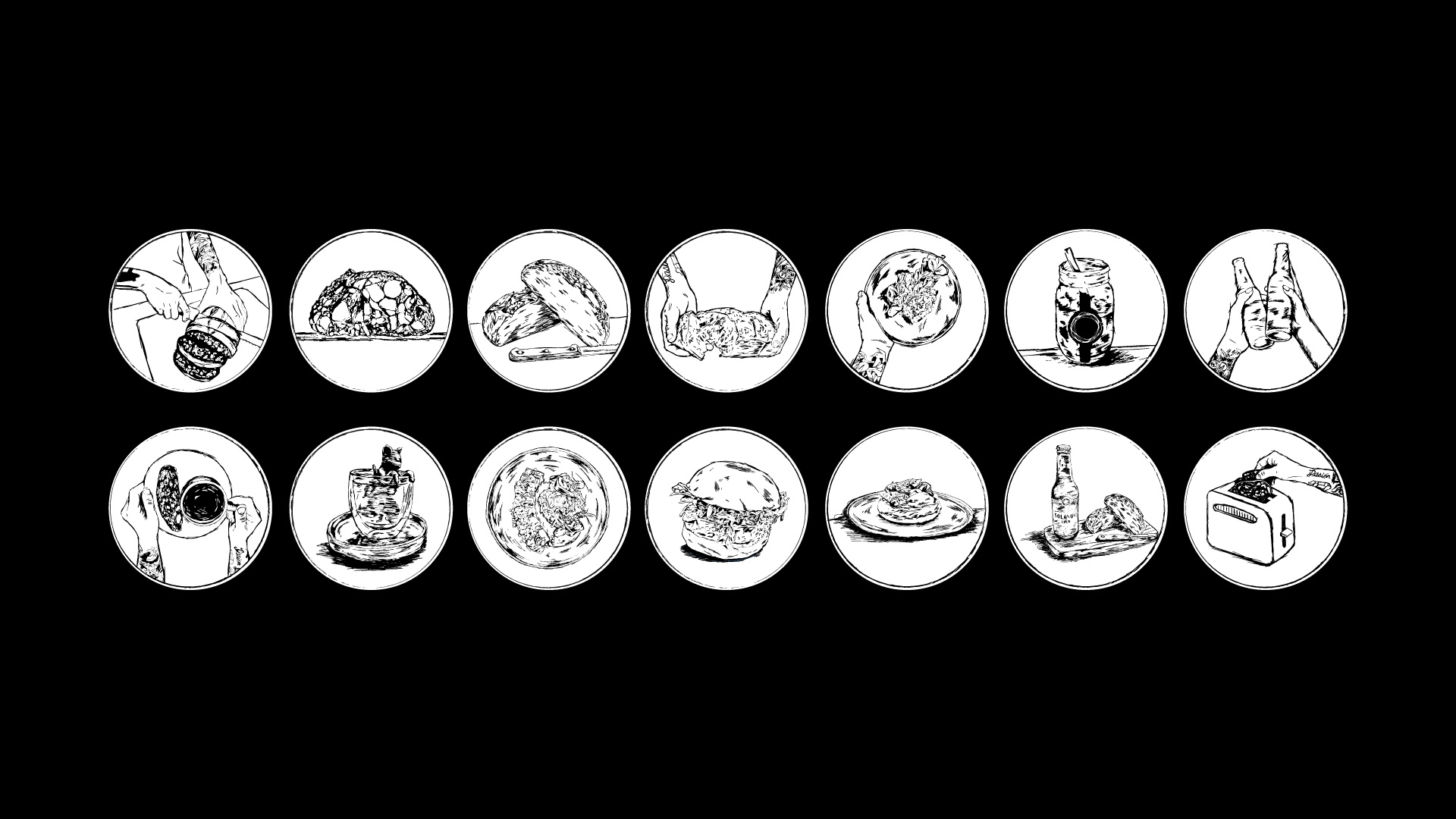
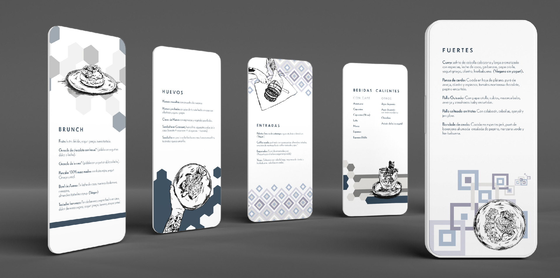
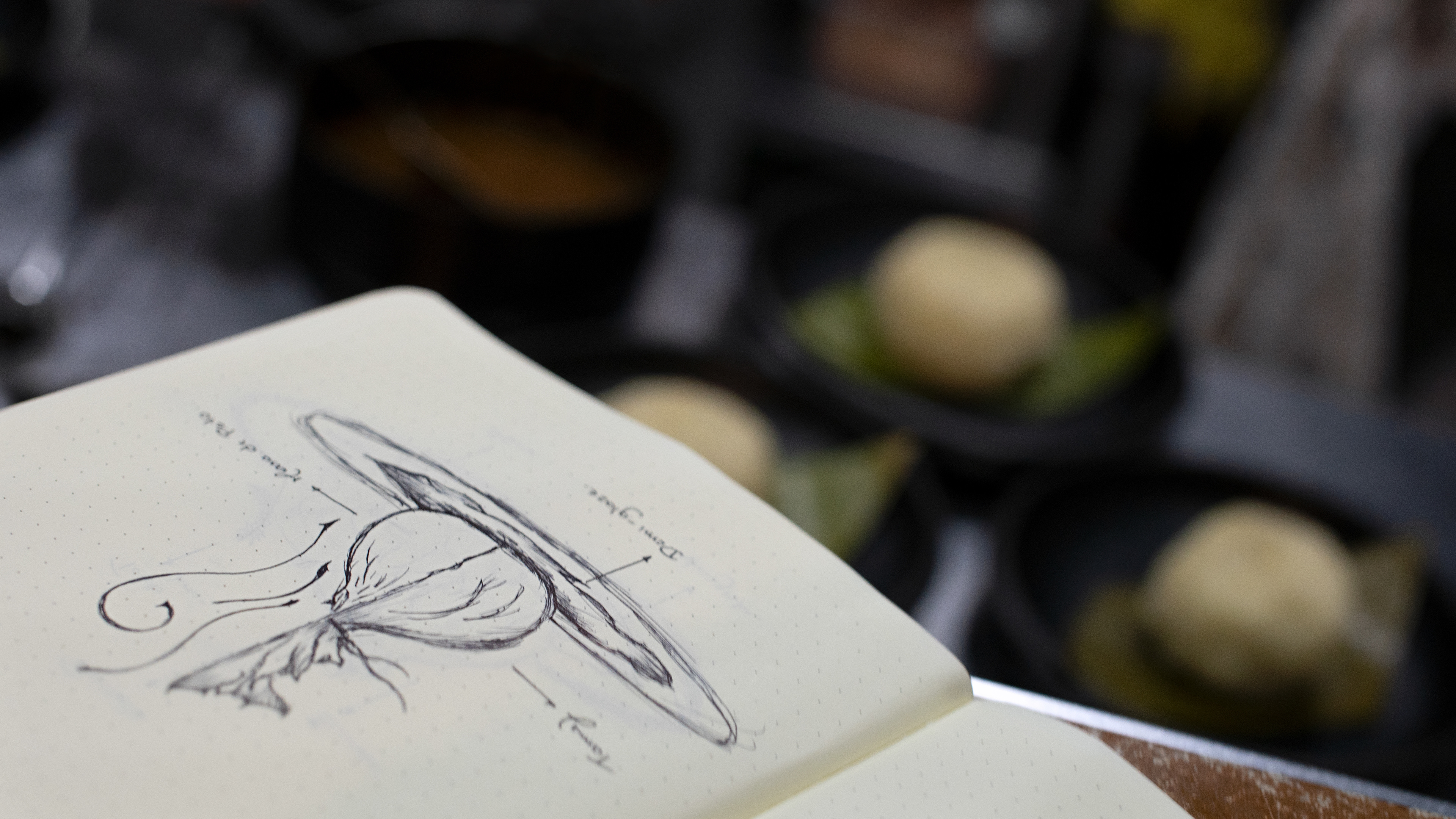
To communicate in a clearer and more assertive way, different illustrations were developed that are part of each of the categories of products and experiences offered by Híbrido, so they can be used in their communication for social networks and menu.

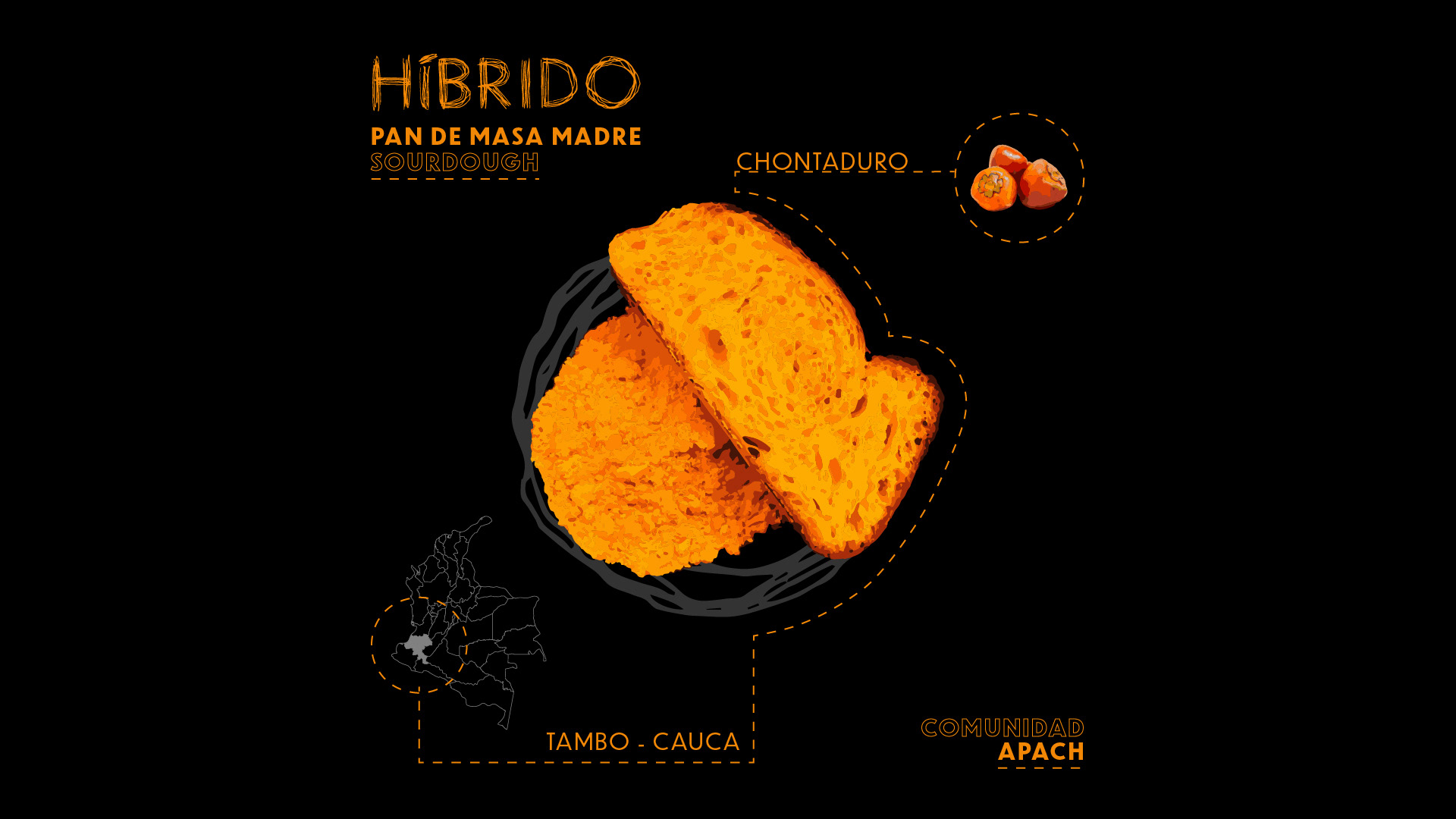
Taking into account the concept and name of the brand, different shapes, textures and colors that are part of the site are used in order to generate a visual hybrid, without limiting its communication to a single shape and specific texture.
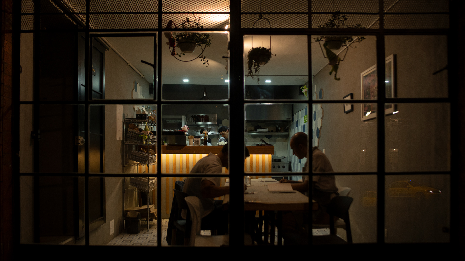
In order to create each of these textures, each of the shapes that are part of the space inside the restaurant, such as floors and walls, were taken as a reference. In order to use these shapes to create different patterns.
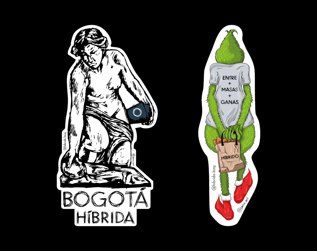
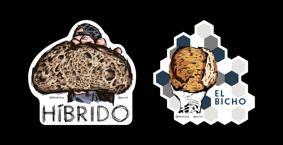
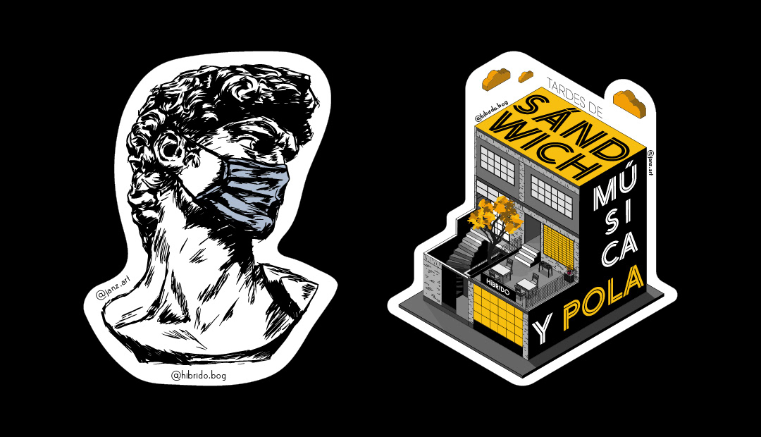
Hí allows us to explore and implement different visual styles, and for this we developed a variety of illustrations that are used as stickers for different times or seasons in the year, such as birthdays in Bogota, Christmas, new events or new product launches.
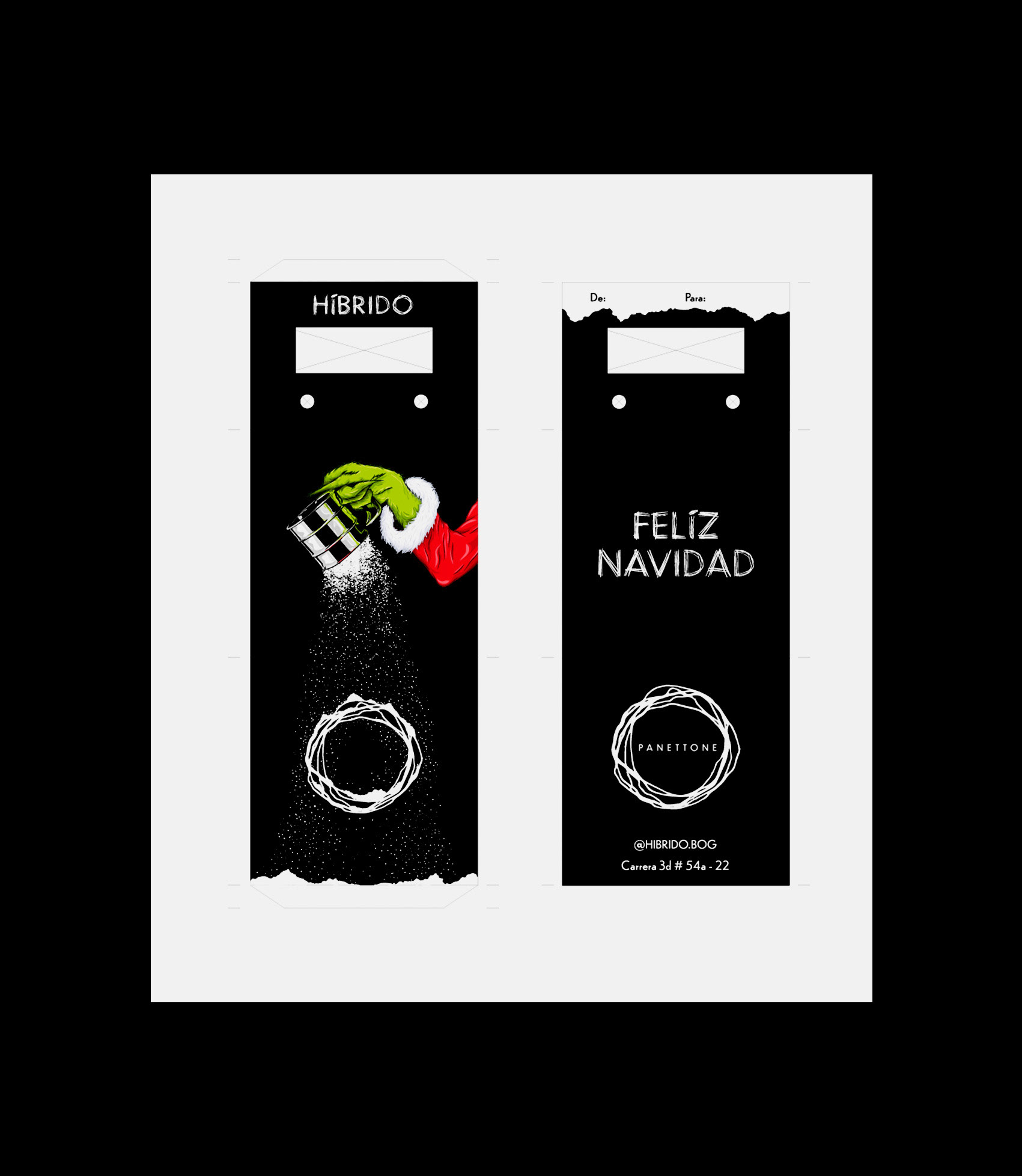
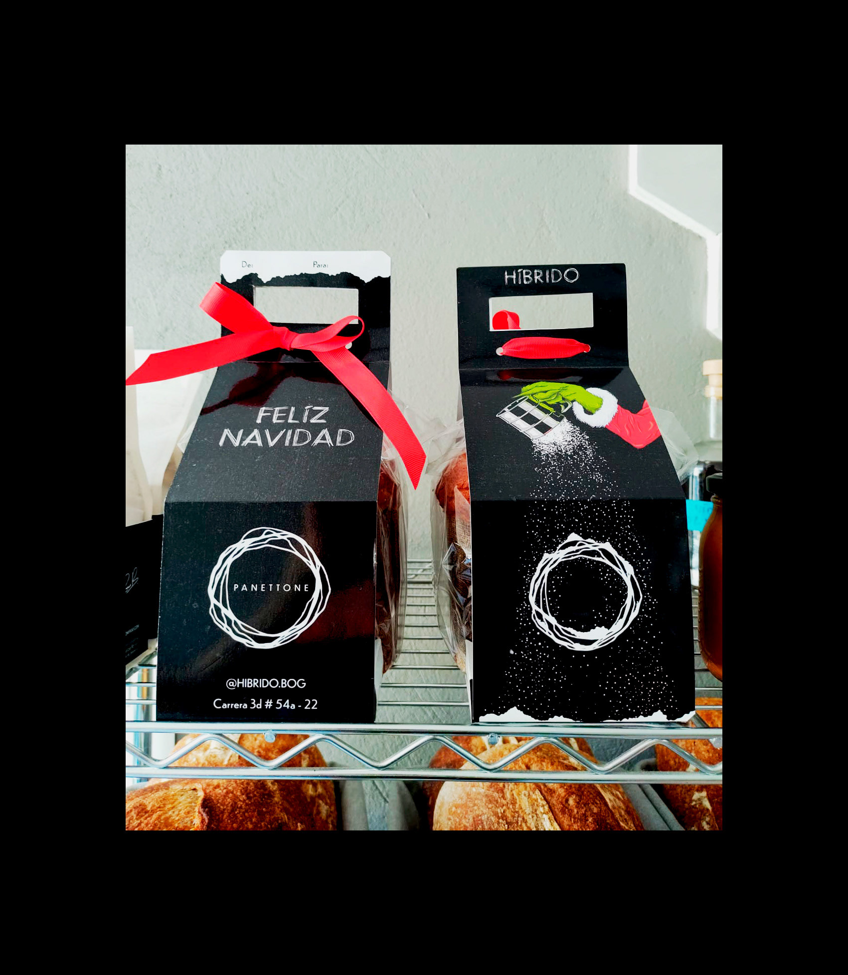
The variety of products offered by Híbrido allows the creation of different packaging that helps to strengthen brand recognition and proper exposure of its products.

Wilson Garzón - Juan Sebastián Díaz
Concept and direction
Juan Sebastián Díaz
Graphic design and illustration
Natalia Romero Jaimes
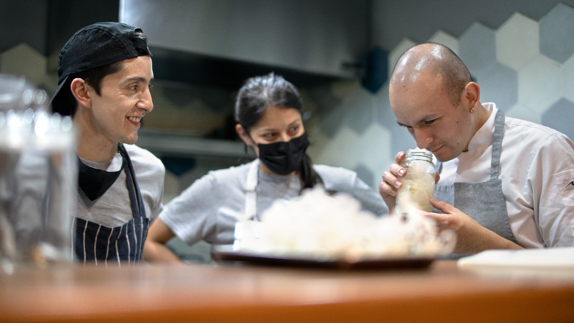
Photography